nenupy.io.tf_utils.plot_dynamic_spectrum
- nenupy.io.tf_utils.plot_dynamic_spectrum(data, time, frequency, fig=None, ax=None, figsize=(10, 5), dpi=200, xlabel=None, ylabel=None, clabel=None, title=None, cmap='YlGnBu_r', norm='linear', vmin=None, vmax=None)[source]
Plot a dynamic spectrum. This function uses
pcolormesh()in the background.- Parameters:
data (
ndarray) – Two-dimensional array, shaped like (time, frequency).time (
Time) – One-dimensional time array.frequency (
Quantity) – One-dimensional frequency array, ifylabelisNone, theunitis automatically used to describe the axis.fig (
Figure, optional) – Matplotlib figure if already existing, by defaultNoneax (
Axes, optional) – Matplotlib ax if already existing, by defaultNonefigsize (Tuple[
int,int], optional) – Size of the figure in inches, by default (10, 5)dpi (
int, optional) – Dots per inch (best quality is around 300), by default 200xlabel (
str, optional) – Label of the x-axis (time), by defaultNone(i.e., generic label)ylabel (
str, optional) – Label of the y-axis (time), by defaultNone(i.e., generic label)clabel (
str, optional) – Label of the colorbar, by defaultNone(i.e., empty)title (
str, optional) – Title of the graph, by defaultNone(i.e., empty)cmap (
str, optional) – Colormap (see matplotlib colormaps), by default “YlGnBu_r”norm (
str, optional) – Normalization of the colorbar (‘linear’ or ‘log’), by default “linear”vmin (
float, optional) – Minimal data value to plot, by defaultNonevmax (
float, optional) – Maximal data value to plot, by defaultNone
- Returns:
The figure and ax objects
- Return type:
- Raises:
ValueError – Raised if
normdoes not match supported value.
Examples
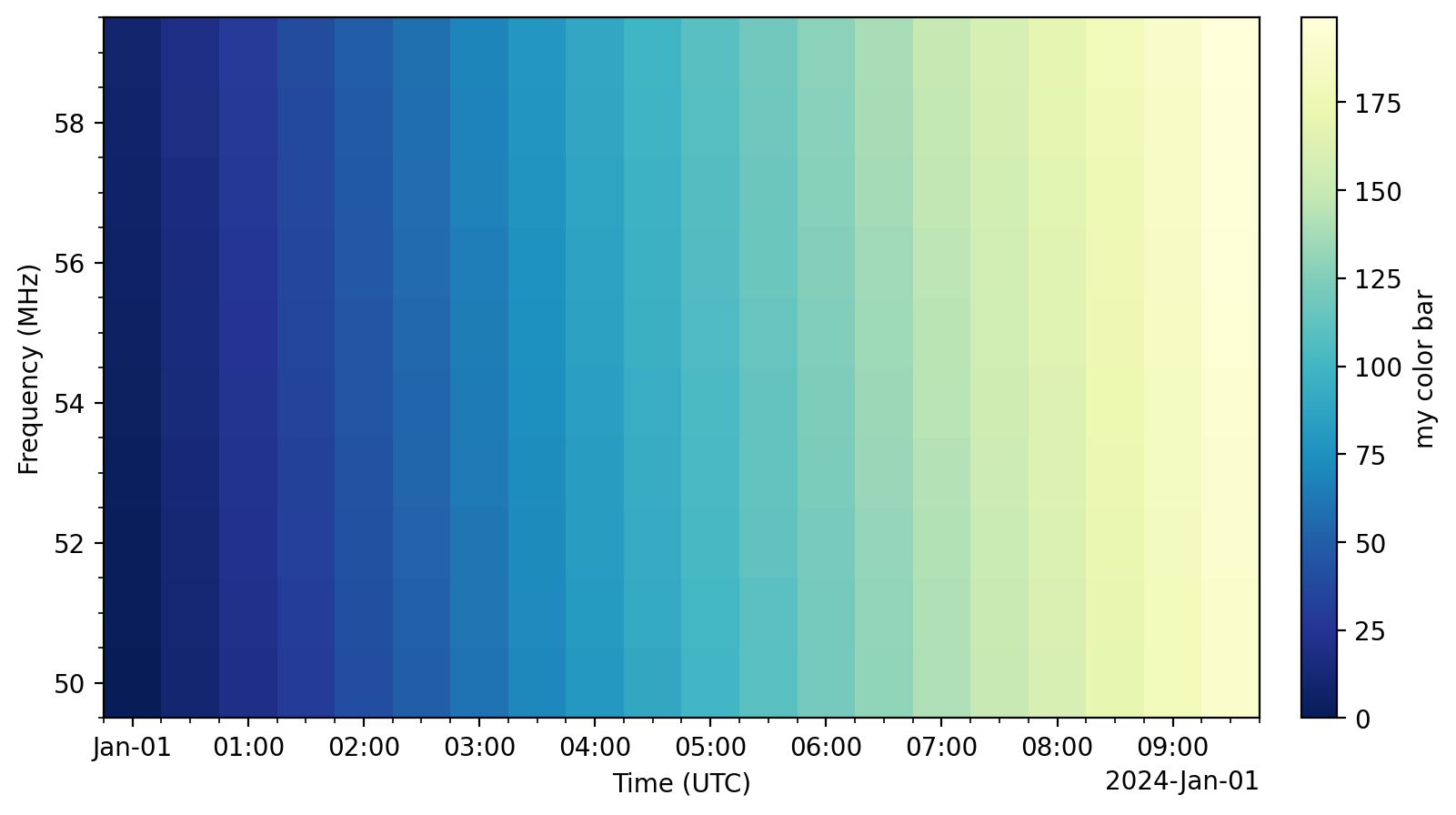
>>> from nenupy.io.tf_utils import plot_dynamic_spectrum
>>> from astropy.time import Time, TimeDelta
>>> import astropy.units as u
>>> import matplotlib.pyplot as plt
>>> import numpy as np

>>> n_times = 20
>>> dt = TimeDelta(1800, format="sec")
>>> n_freqs = 10
>>> df = 1 * u.MHz
>>> fig, ax = plot_dynamic_spectrum(
        data=np.arange(n_times * n_freqs).reshape((n_times, n_freqs)),
        time=Time("2024-01-01 00:00:00") + np.arange(n_times) * dt,
        frequency=50 * u.MHz + np.arange(n_freqs) * df,
        clabel="my color bar",
        norm="linear",
    )
Warning
Do not forget to release the matplotlib cache (using
close()), either after calling several times this method, and/or once you are done with your desired plot. Otherwise you may suffer from significant performance issues as the plots stacks in the memory…>>> plt.close(fig)
or
>>> plt.close("all")